So you need a wonderful portfolio and a CV to help you get your way though to an interview.
Cv's are awfully annoying things. Well, not really the CV that you hand over. (Though that is variable. I've heard of people attaching poetry to theirs...) It's more just trying to super compress your life's work into one piece of paper, keep it interesting, keeping it fresh and trying not to bore a potential employer while your at it.
And the real dilemma is why should they employ the graduate with neary a job to their name? Well this could turn into the blog of how to give up with as little shame as possible. But I try not to give up. Unless it's really hard, then I just complain about it and then get back to work.
I think it's that visual punch to the face. (Okay not the best expressive turn but you will get what I mean). It's that "Wham" or "Wow" effect that makes that one CV stand out in front of aaaaall the others. It's tricky, there are the brilliant, and then there are the insane, and then there are some that are so mad I could almost give the person the job for having the balls to do it.
 | |
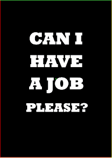
| The direct approach rarely works for me. |
Thing is how do you be direct and not scary, how do you be subtle without being invisible. Writing the perfect CV to me is akin to a Zen riddle. There are some good examples out there. But it all depends on who your targeting. If it's something design related then there is the elbow room to do something totally new fresh and interesting.
I've been tempted to port my current CV to another more interesting format. Perhaps something a little funky and different, something you don't see on a day to day basis that gets noticed...how I have no idea yet. But as a designer it seems somewhat odd just to offer up a simple sheet of paper to get someone's attention. Okay, its cheaper, but when has that stopped a designer from doing what a designer does best?
Well I'll think of something...eventually.
Laters.
No comments:
Post a Comment